Designing the
Got Time app
Got Time was my own idea for a mobile app that makes it easier for friends to meet up without hassle.
Brief
Get together with your friends the easy way with the Got Time app. Pick the dates you’re available, share them via link and let your friends vote which day is best. The goal of the app is to help you find the best date the quickest and simplest way possible. The app can be used for any type of meeting, but is primarily meant for informal meet ups between friends and family.
UI/UX design: Elian Duits
Visual design: Arjen Duits
Challenge
The conventional app to use for meeting up in the Netherlands is Datumprikker, which tries to solve the same problem as Got Time. The challenge therefore is to show users that Got Time would be a better alternative to use than Datumprikker.
Research
As this was an idea for a new product, I began by simply talking to people around me. Asking friends and family how they went about meeting up with people, if they had used Datumprikker and what their experiences were.
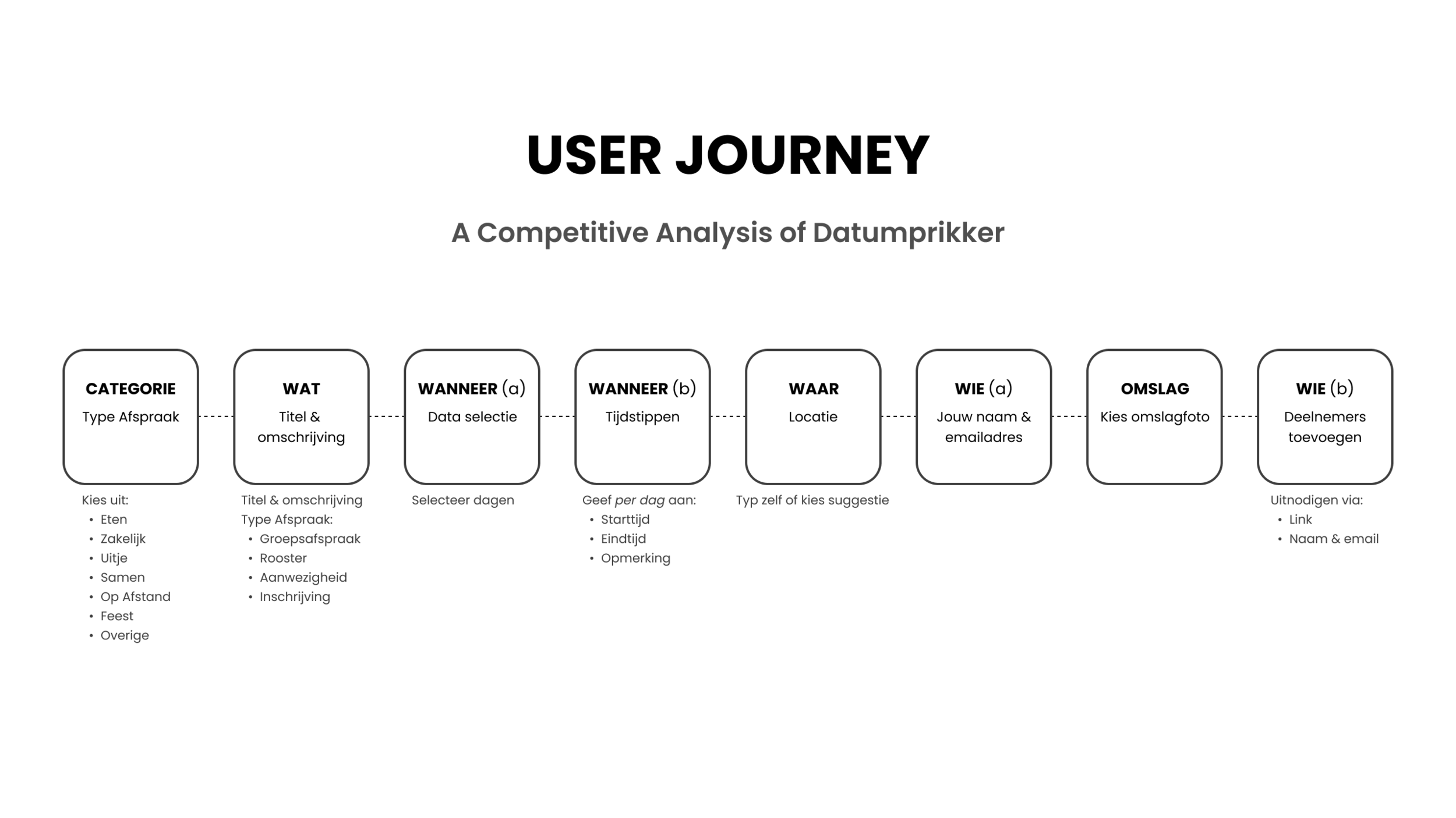
Almost everybody had used Datumprikker for meet ups, but most felt that Datumprikker took too long and was too complicated. Setting up an event takes you through eight separate pages, each one requiring you to input all kinds of information.
Others added that they did not even bother anymore with Datumprikker. They just propose one date to the group on a mobile chat app and see if the others are available on that day as well.
Analysis
Looking at the options out there, I wondered if it was possible to make sharing dates as easy as sharing a gif. Therefore, it must be made as easy as possible for users to pick dates and a time. Going through Datumprikker’s eight different pages makes you lose oversight.
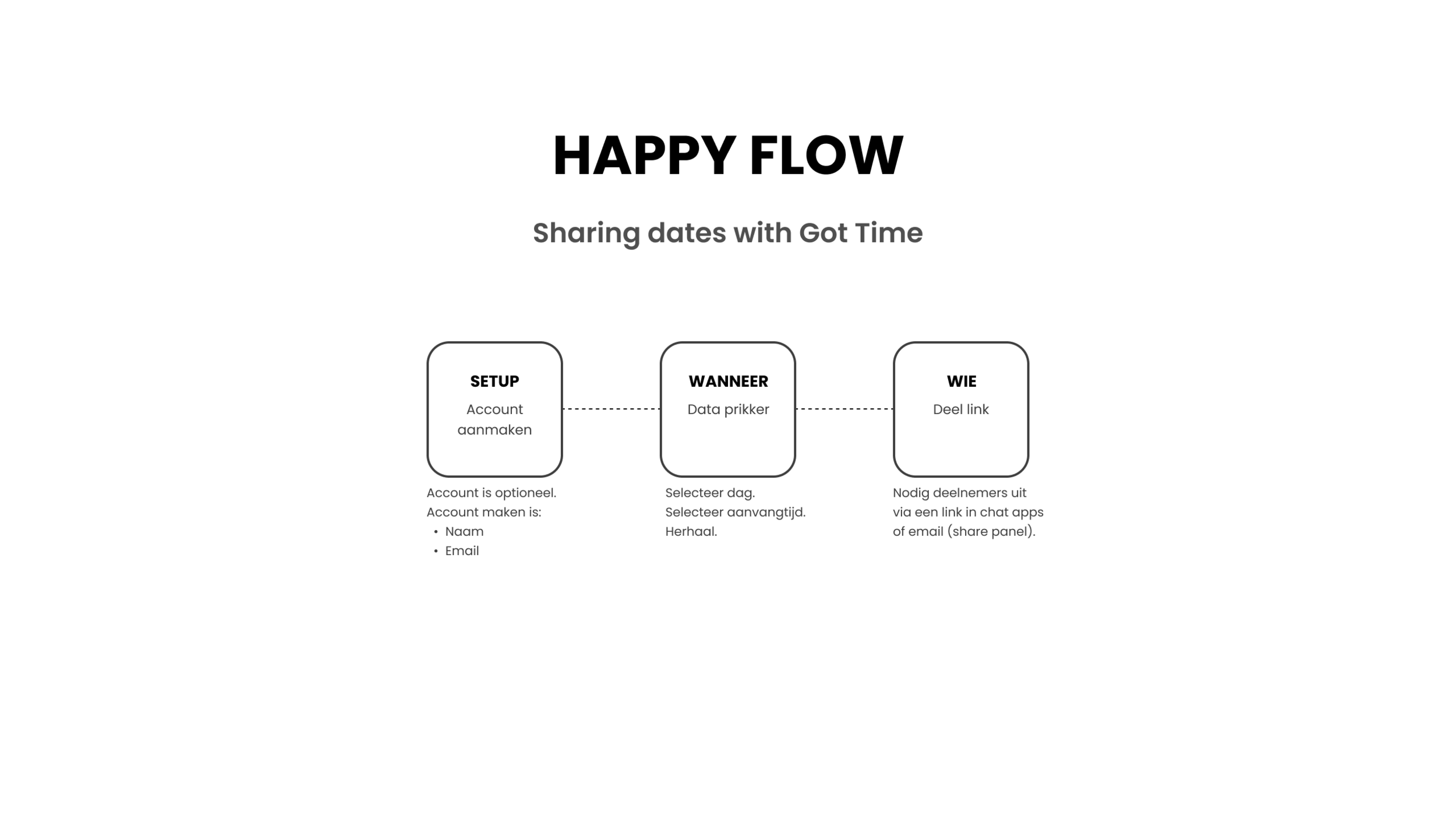
So to maintain clarity and oversight, I became determined to try to fit all key functionalities in as few pages as possible to create the best user experience.
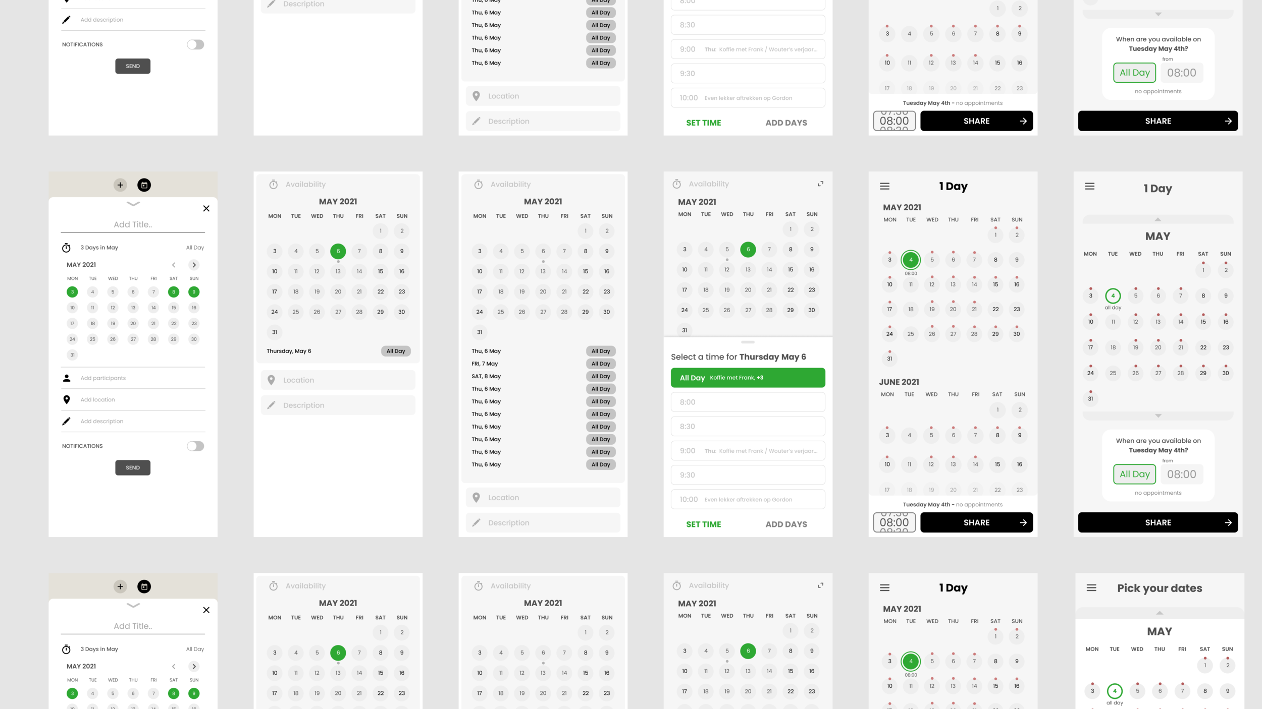
The wireframes of testing out different layouts.
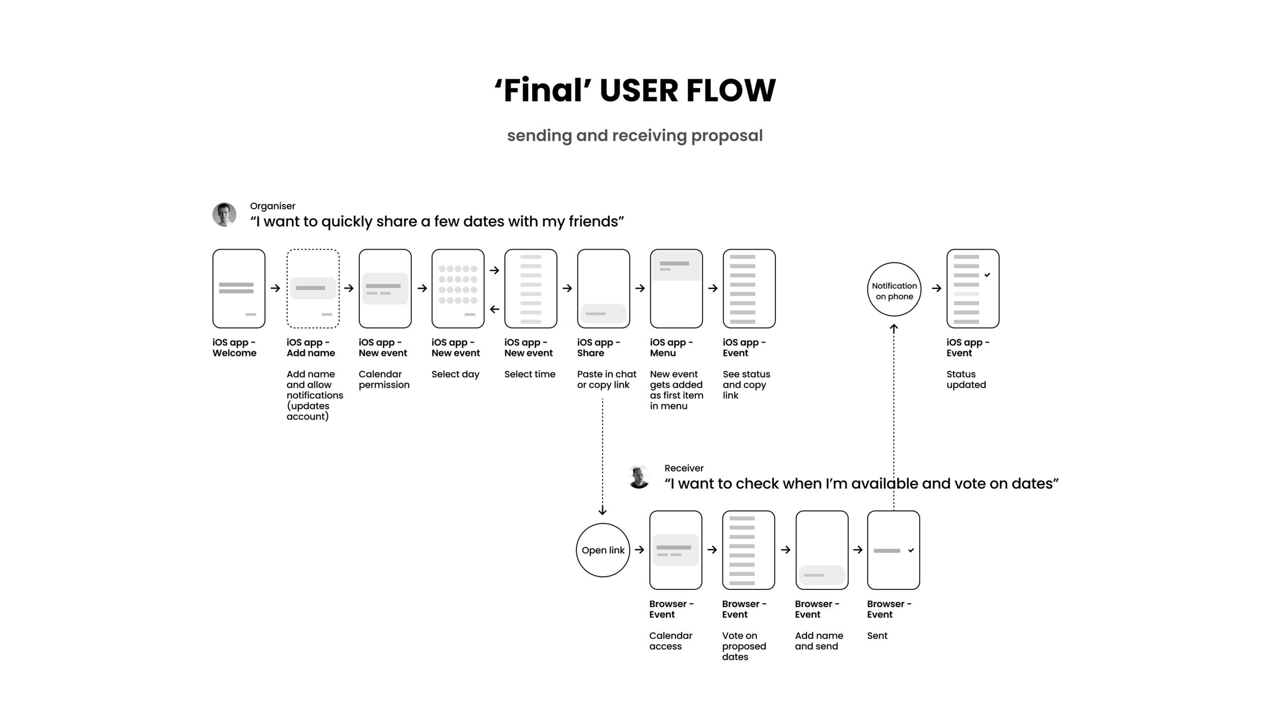
Working out all the steps from both the host and receiver point of view
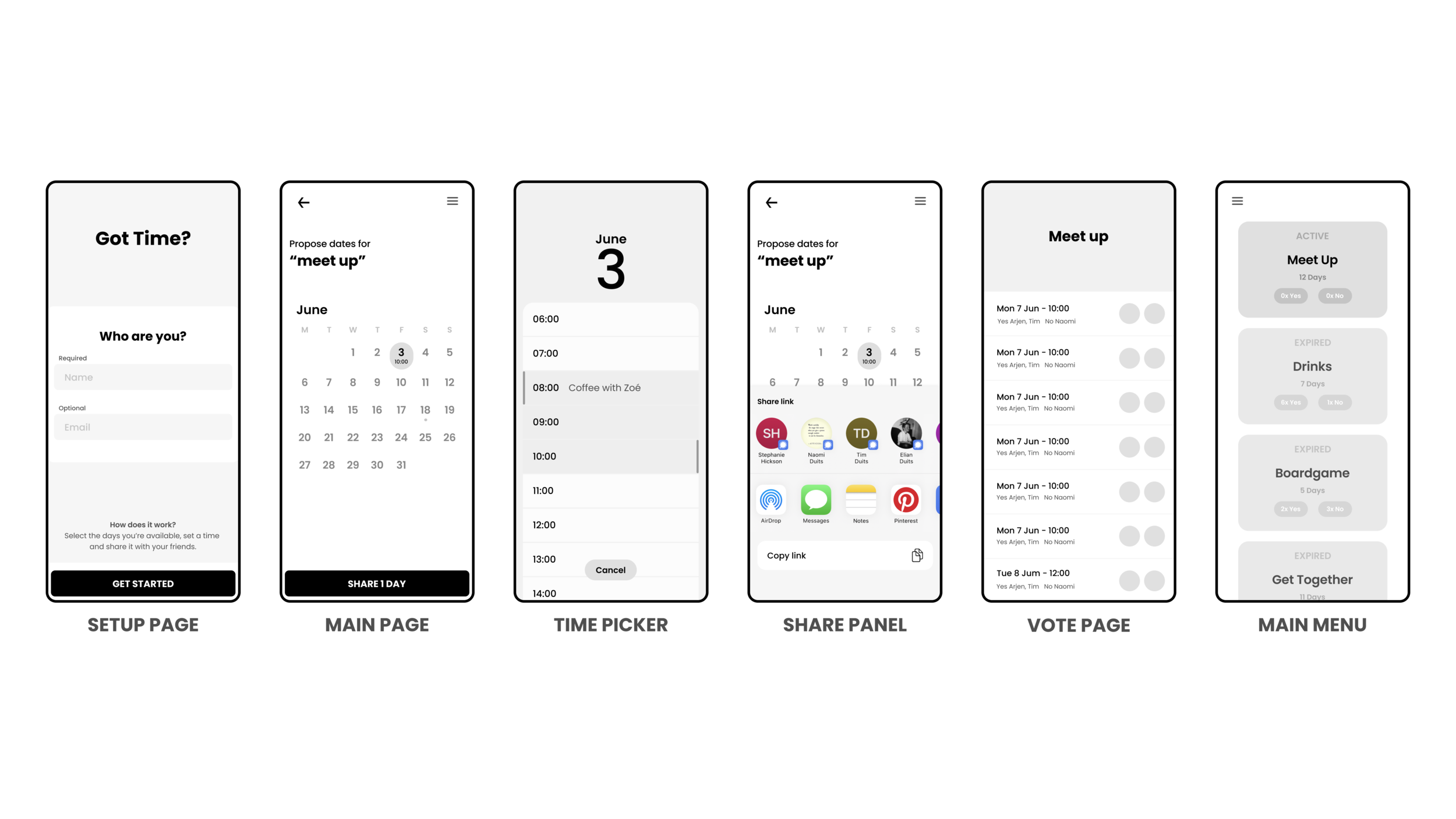
The wireframes of the most important pages.
Solutions
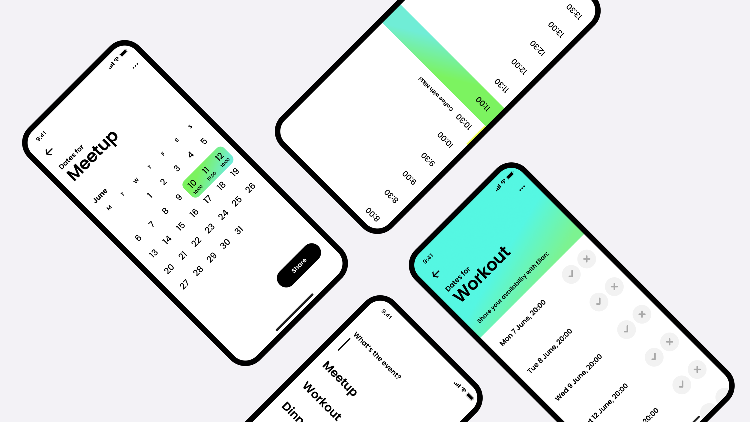
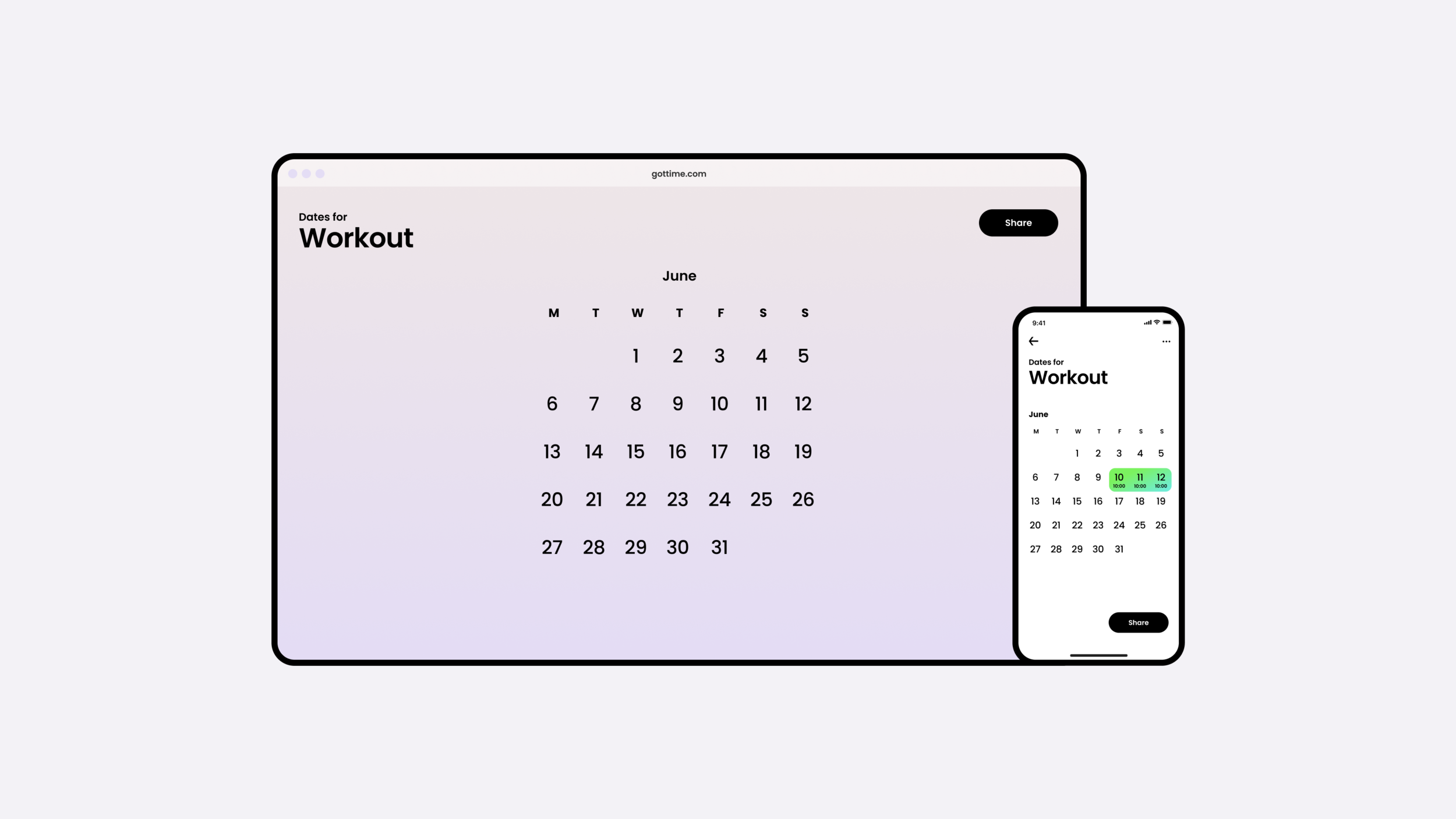
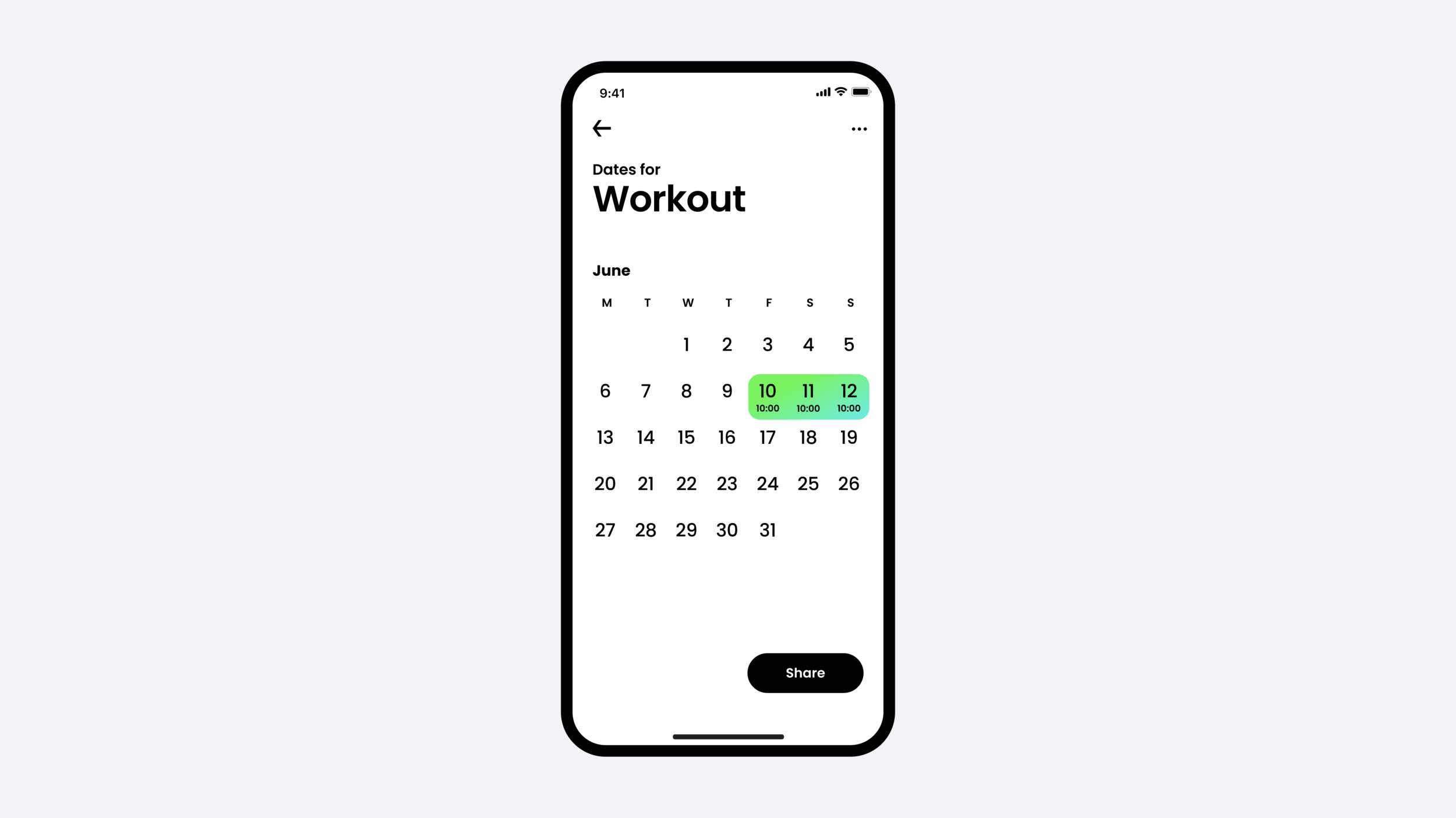
During testing, I came to the conclusion that getting this app right will depend on getting the date and time selection to work seamlessly. Working through endless wireframes I eventually found what the best solution would be. Selecting a date brings up a fullscreen time picker wherein you select the starting time - because why set an end time when meeting up with friends?
The selected time is shown right underneath the date. A share button at the bottom brings up the share panel with which you can easily share a link with your friends.
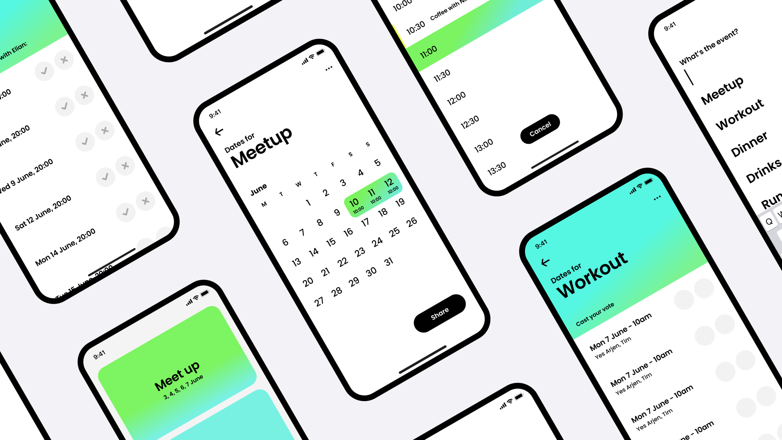
For the visual style, we wanted to enforce the sense of simplicity but make it really come to life with bright gradient colors to accentuate various pages.
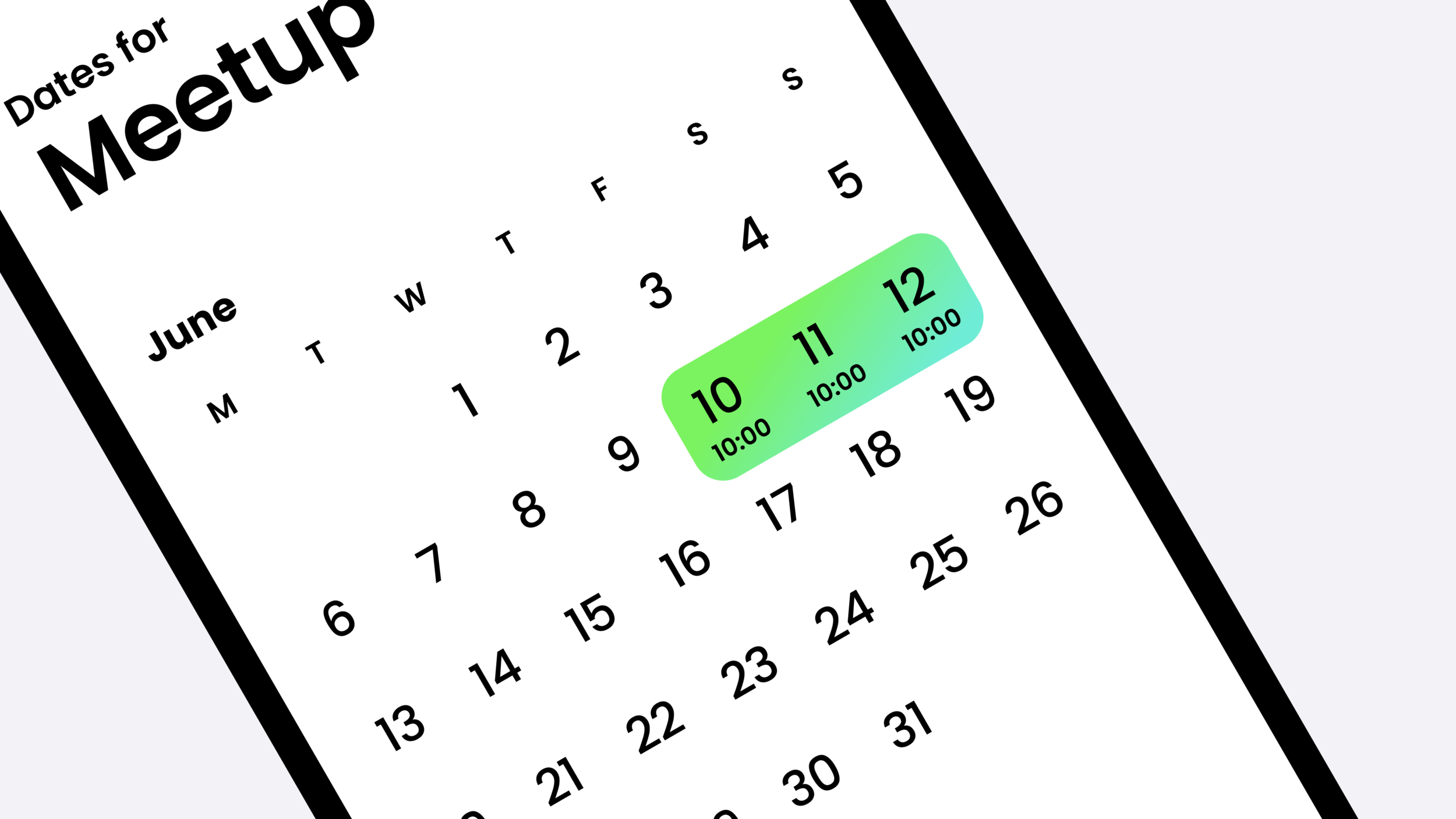
The Main Page - showcasing the date and time selection.

